


Written by
Tim Collins
Published on
14 August 2026
You spend an afternoon getting a campaign to look just right, you send it, and on your phone it looks nothing like the version you built. The crisp white background has gone charcoal, your logo is sitting in a glaring white box, and a line of text has vanished into the background entirely.
You have just met dark mode, and if you send email you are already sending into it whether you designed for it or not. More than half of people now read with their device or inbox set to a dark theme, and the major apps quietly rewrite your email to match. The good news is you do not need to build a separate dark version. You need to understand what the apps are doing, and make a handful of colour choices that survive it.
What dark mode actually does to your email
When someone reads in dark mode, their email app recolours your message on the fly. There is no single standard for this. Gmail, Apple Mail and Outlook each apply their own rules, which is why the same email can look fine in one inbox and broken in another.
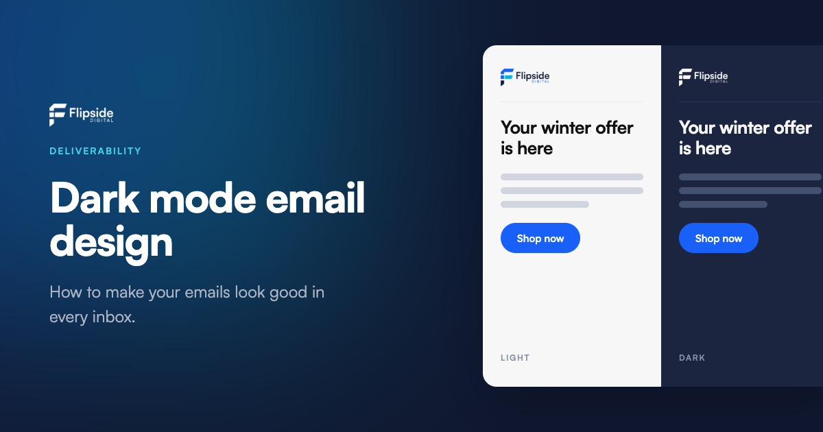
The most common behaviour, and the one worth designing for, is the Gmail approach: it flips background and text colours and leaves everything else alone. A near-white background becomes dark grey, a near-black background becomes light, colours in between shift, and text is recoloured so it stays legible against its new background. Images, logos and background images are left untouched.
That last detail is the source of most dark mode problems. The app confidently recolours your text and panels, but it will not touch a logo with a baked-in white background, so you end up with a bright white rectangle floating in a dark email. And because every app does this slightly differently, the only way to know is to look.
The colour rules that keep you safe
Almost every dark mode problem comes down to colour, and the fixes are small.
Use hex or RGB colours, never named ones. A colour written as #1A1A1A or rgb(26,26,26) transforms predictably. A colour written as the word black or white is often left untouched by the app, which is how you end up with black text sitting on a background that has just turned dark. If you take one thing from this article, make it this: specify every colour as a hex or RGB value.
Get your contrast right in light mode first. If your text and background have genuine contrast in the normal version, that contrast almost always survives the flip to dark. Weak, low-contrast design is what falls apart, because there is no margin to absorb the recolouring.
Avoid pure black and pure white for large areas. Very-near-black like #111111 and very-near-white like #F7F7F7 transform more gracefully and look far less harsh than #000000 and #FFFFFF. Pure values tend to produce the jarring, high-glare result people associate with a broken dark mode email.
Keep your buttons strong and mid-toned. A solid, saturated button colour reads well against both a light and a dark background. Pale or washed-out buttons are the ones that disappear.
The logo problem, and how to solve it
If there is one thing that catches people out, it is the logo. A logo saved as a JPG, or a PNG with a solid white background, will keep that white background in dark mode, and the app will not fix it. On a dark email that white box is the first thing the eye goes to, and it looks like a mistake.
The fix is a transparent PNG. With the background removed, the logo sits naturally on whatever colour the email becomes, light or dark. If your logo is dark-coloured artwork on transparency, add a subtle light outline or a small amount of padding so it does not disappear against a dark background. The same thinking applies to any image that relies on a white background to look clean.
And wherever you can, keep important words as real text rather than baking them into an image. Text adapts to dark mode. An image-only header or offer does not, so if the app handles it badly there is no fallback and your key message is the thing that breaks.
Preview before you send
The single best habit is to look at the dark version before it goes out, not after. In FlipSend the email builder has a dark mode toggle in preview, so you can see roughly how your design lands in a dark inbox and fix the obvious problems without sending yourself a string of test emails. Check the whole thing together: header, logo, body text, buttons and footer. Contrast issues and white-boxed logos jump out immediately once you are looking for them.
It is an approximation, because no preview can perfectly reproduce what every app does, but it catches the problems that matter. Treat it as a final check in the same way you would proofread the copy.
Where dark mode fits with everything else
Designing for dark mode is really part of a bigger idea: your email should look right and read easily wherever it lands, because that is what keeps people engaging with it. An email that looks broken gets deleted, and deletions and low engagement are exactly the signals that push future mail towards the spam folder. Looking good in dark mode is not separate from deliverability, it feeds into it. If you want the fuller picture on what sends mail to spam, we went deep on that in our guide to why your emails go to spam, and on how to see where your mail actually lands in our piece on inbox placement testing.
Get the colours right, use a transparent logo, and preview the dark version before you send. That is most of the battle, and it costs you nothing but a few minutes.
Build emails that work in every inbox
FlipSend gives you a drag-and-drop builder with a built-in dark mode preview, so you can design once and check it lands properly light or dark before a single email goes out. And like everything we run, it is built and hosted in Australia, which matters if you work in healthcare, government, education or anywhere the Privacy Act 1988 shapes what you can do with customer data.
If you want a second set of eyes on how your current emails are landing, we are happy to take a look and tell you plainly. It takes about ten minutes and there is nothing to sign.
FlipSend by Flipside Digital. Email, SMS and fax from one platform, built and hosted in Australia.